
Saturday, December 31, 2011
Video - BATMAN RETURNS Michael Keaton Mentos TV Commercial
OK, This Fake MENTOS CANDY "BATMAN RETURNS Movie Parody" TV Commercial is kinda corny, but it is nice to see Michael Keaton again. Plus, the editing is actually pretty decent.
Friday, December 30, 2011
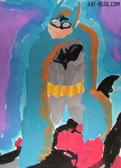
Celebrating BATMAN-INSPIRED CREATIVITY, Oh Yeah!


Here are some random images I have come across while surfing the web ( Yes, I have NO life ) that are both FUN and Batman-Related! The 1st photo is a beautifully made Custom CATWOMAN My Little Pony Figure done by an Artist named Mari Kasurinen. Of course, this is the version from the older BATMAN RETURNS Movie and not the NEW "Anne Hathaway" from "The Dark Knight Rises". To see more amazing Custom Toys just click HERE!
Next up is a Watercolor Painting that totally cracks me up! Here are 2 characters from "The Imaginary World" of a Cartoonist named Dan Goodsell. He has a comic strip called "Mr. Toast" and these are his 2 friends, JOE THE EGG and SHAKY BACON dressed-up as the Dynamic Duo! Dan's artwork is a lot of fun and once you start reading it you'll be totally hooked, check this out, click HERE!
OK, The last photo is one I came across on a Cosplay Website. Somebody made a very clever CLAYFACE Costume from the "Batman: The Animated Series" TV Cartoon. This is a character you never see done. I guess because it would be both a nightmare to create and to wear, ha! But you gotta give this person credit, he did an extremely amazing job!
YAMAHA CUSTOM 1966 BATMAN TV Show BAT-CYCLE For Sale in Canada


Check out these great photos from a Classified Ad in Canada! It appears that somebody there is selling their Custom 1966 Yamaha BATMAN TV SHOW BAT-CYCLE Motorcycle. The asking price is only around 15-Thousand, which seems pretty fair to me considering how much a brand-new motorcycle costs. Plus, this one is both "Vintage" and "Totally Bad Ass", ha ha! For more information be sure to click HERE. Oh yeah, one last thing, my Birthday is in January, on the 19th. So if you need my mailing address to send this to me then please let me know. ( Thanks Clark )
Gary's Amazing HARLEY QUINN and THE JOKER Tattoo Art Photos


We love it when Bat-Blog Fans share pictures with us and here's a great example! This is a photo from a guy named Gary who lives in Spain. He has 2 Batman-related Tattoos of The JOKER and HARLEY QUINN! The Joker, of course, is the iconic cover art done by Brian Bolland for the BATMAN: THE KILLING JOKE Graphic Novel. The Classic "Joker snapping a photo" image... Awesome! Next, on the other side of his arm, is a graphic of Harley Quinn. These are both great choices and the Tattoo Artist did a very wonderful job here. Thanks for sharing these Gary, very cool!

Warp Back In Time To The Lost Star Trek Concept Art By Ralph McQuarrie and Ken Adams
 After working on the ground-breaking special effects for Star Wars, Ralph McQuarrie and production designer Ken Adams were tasked with bringing another science-fiction powerhouse to the big screen: Star Trek: Planet of the Titans.
From 1976 to 1977 they worked hard to bring McQuarrie's unique vision to life with Star Trek, but the project was eventually abandoned.
Immediately after Ralph finished work on Star Wars Episode IV[: A New Hope] he began designing 'Star Trek - Planet of the Titans'. This was Paramount's first attempt at taking Star Trek to the big screen .
The production design was handled by Ken Adam (of James Bond fame) and the director was Philip Kaufman.
The plot concerned a battle between Starfleet and the Klingon Empire over ownership of a world, a world that legend had it was once inhabited by an extinct, but technologically superior race known as the ‘Titans’.The Federation fights with the ‘Cygans’ a race that were apparently to blame for the Titans disappearance. A black hole consumes the planet, followed by the Enterprise. The Enterprise is pushed thousands of years into the past, back to a time when primitive man still roamed the Earth. Kirk and crew introduce the natives to fire and the story comes full circle as we discover that the crew of the Enterprise themselves were actually the Titans of legend.Although the project was abandoned Paramount moved forward developing a new television series ‘Star Trek: Phase Two’.
This also floundered after the success of Star Wars Episode IV - when the decision was made to adapt the pilot episode ‘In Thy Image’ into a movie instead. This would eventually become 'Star Trek the Motion Picture'.Director Kaufman described it this way:
"My version was really built around Leonard Nimoy as Spock and Toshiro Mifune as his Klingon nemesis. My idea was to make it less 'cult-ish', and more of an adult movie, dealing with sexuality and wonders rather than oddness; a big science fiction movie, filled with all kinds of questions, particularly about the nature of Spock’s [duality]—exploring his humanity and what humanness was. To have Spock and Mifune’s character tripping out in outer space. I’m sure the fans would have been upset, but I felt it could really open up a new type of science fiction."Adam's and McQuarrie's designs were never used, but stand as a testimony to their enormous skills. Eventually, he would go on to create illustrations for Star Trek: The Voyage Home.
Most of the images below along with their descriptions can be found in the book "Art of Ralph McQuarrie".


"Planet of the Titans"sketches by Ken Adams

"Superbrain" by Ken Adams


Ralph's rendering of designer Ken Adam's concept for the Enterprise.

"Asteroid Docking Bay production painting." by Ralph McQuarrie
McQuarrie: There was no script, we were just winging it, coming up with all kinds of ideas. I was able to introduce my inhabited asteroid concept, which again went unused when the the plans for a feature film were dropped for a few years.

"Asteroid Docking Bay Interior production painting and thumbnail sketches." by Ralph McQuarrie

"Enterprise interior" by Ralph McQuarrie

"Vulcan shuttle and interior" by Ralph McQuarrie

"crew uses tiny pod to cross to opening in shaft)"
McQuarrie: I had devised a concept for the end of the film... Some alien form has designed a way to use the power of a black hole's gravity to form a spherical shroud around the black hole. If you have a dense enough material, gravity cannot penetrate it. There are two openings in the shroud that they would use to pull ships in. The saucer of the Enterprise (which was detachable) ends up in the shroud. They meet the aliens and had a dramatic finale. These two images are of the Enterprise saucer in the shroud.


"Detached Enterprise saucer concept sketch." by Ralph McQuarrie
McQuarrie: The disc of the enterprise (sic) would separate from the rest of the ship to land on the surface of planets.
This detached saucer idea would be incorporated into the design of the "Enterprise-D" for Star Trek: The Next Generation.
See more of Ralph McQuarries work at http://www.ralphmcquarrie.com/
Via io9
Images from trekbbs
Thursday, December 29, 2011
'Rise of the Planet of the Apes' (2011) BLU-Ray Special Features Review

The Details
Actors: James Franco, Andy Serkis, Freida Pinto
Directors: Rupert Wyatt
Format: AC-3, Color, Dolby, DTS Surround Sound, Dubbed, Subtitled, Widescreen
Language: English
Subtitles: English, Spanish
Region: Region A/1 (Read more about DVD/Blu-ray formats.)
Aspect Ratio: 2.35:1
Number of discs: 2
Rated: PG-13 (Parental Guidance Suggested)
Studio: 20th Century Fox
DVD Release Date: December 13, 2011
Run Time: 105 minutes
Special Features
Disc 1: Theatrical Feature Blu-ray
- Deleted Scenes
- Mythology of the Apes
- The Genius of Andy Serkis
- A New Generation of Apes
- Scene Breakdown
- Character Concept Art Gallery
- Breaking Motion Capture Boundaries
- Composing the Score with Patrick Doyle
- The Great Apes
- Audio Commentary by Director Rupert Wyatt
- Audio Commentary by Writers Rick Jaffa and Amanda Silver
- Theatrical Trailers
Disc 2: DVD + Digital Copy
The Review
The sections on how they did the special effects are pretty cool. The "Scene Breakdown" and "The Genius of Andy Serkis" were really good at explaining how they did the motion capture. It's pretty jarring to watch men act like apes sitting in cages. Pretty cool.
The key section for me is the "Conceptual Art Gallery". The interface has a series of images divided into seven main ape characters (Rocket, Maurice, Koba, Caesar, Bright Eyes, Buck and Lucky) from the film. You click on the character to see the artwork.
The images are high quality, but sparse. Maybe less than twenty. You can get better concept art.from google. I'm pretty sure some of them are reference photographs, unless they have an incredibly high resolution.
Here's the breakdown:
Artist credits: No
Still images: Yes
Resolution: High
Number of images: Low (less than 20)
Zoom: No
So, the disc gets three out of a possible five stars.
Buy it here at amazon.
What did you think of the movie and the Blu-Ray disc?
Wednesday, December 28, 2011
VINTAGE BATMAN COLLECTIBLES - Chewing Gum and Candy!


For new readers, the BAT-BLOG.COM is mainly about the joys of being a Collector of the Toys and other fun Bat-Memorabilia, both new and vintage. Here are some examples of older items that are sort of "Candy or Chewing Gum" related. The 1st photo is probably the rarest of all the ones shown here, it's a Package for 1966 BATMAN CANDY STICKS from England. I totally love the graphics on this thing!
Next up is another UK Candy item except they're a little more new. These were also Candy Sticks but featured art from BATMAN THE ANIMATED SERIES. They were made by the Thorneycroft Candy Company, which British people would probably be familiar with.
Then we have a photo of some individually-wrapped JUSTICE LEAGUE OF AMERICA Tattoo Bubble Gum! These were made in the USA by the Fleer Candy Co. between 1969 and 1970. When you open the tiny wax wrapper there's a separate piece of paper with one of those water-based tattoos on it. I actually have one of these, with BATMAN... unopened!
OK, last but not least, is a photo a Friend sent me awhile back because he knew it would torture me, ha! Shown here is a completely full PEZ CANDY DISPENSER Store Display Box!! This is from the mid 1970's and oh my god, they were only 59 cents, ha! We got the Penguin, Joker, Batgirl, batman, and Wonder Woman. Oh yeah, these were also the "rubber head" versions which are way harder to find.
Listen, the BAT-BLOG is about sharing the love of collecting old Bat-Toys and even the new stuff. So, if you have some pics of super-rare items or if you come across some totally brand-new merchandise then please let us know, thanks!
THE DARK KNIGHT RISES Movie Preview TRAILER CATS Style!
OK, I wish I would have come up with this idea. There are a ton of websites that present brand-new movie trailers but there is only one that has taken a very unique spin on it. They're called TRAILER CATS! They take regular trailers and spice them up a little bit, ha! Here's one for THE DARK KNIGHT RISES Batman movie. The only thing that confuses me is why they made CATWOMAN ( Anne Hathaway ) a Dog?! But it's pretty funny, check it out!
THE DARK KNIGHT RISES - Batman Movie Wallpaper Backgrounds


Hey Kiddos, it's Wednesday. You know what that means, it's "Wacky Wallpaper Wednesday"! Yes, it's time once again to post some Free BATMAN Wallpapers. Since there really hasn't been any hype lately from Warner Bros about THE DARK KNIGHT RISES Movie I thought I'd post a few inspired by the film. I gotta say, it's been pretty hard finding decent photos of Catwoman ( Anne Hathaway is still hiding, ha! ) so I guess the focus will be on the BATMAN and BANE characters. Here we go!

See the Future Of Korea In Wachowski's 'Cloud Atlas' Concept Art

The novel consists of six nested stories that take the reader from the remote South Pacific in the nineteenth century to a distant, post-apocalyptic future. Each tale is revealed to be a story that is read (or watched) by the main character in the next. All stories but the last one get interrupted at some moment, and after the sixth story concludes at the center of the book, the novel "goes back" in time, "closing" each story as the book progresses in terms of pages but regresses in terms of the historical period in which the action takes place. Eventually, readers end where they started, with Adam Ewing in the Pacific Ocean, circa 1850.
The Pacific Journal of Adam EwingPacific Ocean, circa 1850. Adam Ewing, an American notary's account of a voyage home from the remote Chatham Islands, east of New Zealand. The next character discovers this story as a diary on his patron's bookshelf.
Letters from Zedelghem
Zedelgem, Belgium, 1931. Robert Frobisher, a penniless young English musician, finds work as an amanuensis to a composer living in Belgium. This story is saved in the form of letters to his friend (and implied lover) Rufus Sixsmith, which the next character discovers after meeting Sixsmith.
Half-Lives: The First Luisa Rey Mystery.
Buenas Yerbas, California, 1975. Luisa Rey, a journalist, investigates reports of corruption and murder at a nuclear power plant. The next character is sent this story in the mail, in the form of a manuscript for a novel.The Ghastly Ordeal of Timothy CavendishUnited Kingdom, early 21st century. Timothy Cavendish, a vanity press publisher, flees the brothers of his gangster client. He gets confined against his will in a nursing home from which he cannot escape. The next character watches a movie dramatisation of this story.An Orison of Sonmi~451Nea So Copros (Korea), dystopian near future. Sonmi~451, a genetically-engineered fabricant (clone) server at Papa Song's diner (a proxy for McDonald's), is interviewed before her execution after she rebels against the capitalist totalitarian society that created and exploited her kind. The next character watches Sonmi's story projected holographically in an "orison," a futuristic recording device.Sloosha's Crossin' an' Ev'rythin' AfterHawaii, post-apocalyptic distant future. Zachry, a tribesman living a primitive life after most of humanity dies during "the Fall," is visited by Meronym, a member of the last remnants of technologically-advanced civilization. This story is told when the protagonist is an old man, to seemingly random strangers around a camp-fire. - Wikipedia
From the description it looks like these are from Korea and possibly Hawaii


No word on who exactly created these yet, but there are some amazing concept artists on this project. George Hull worked with the Wachowski's on both The Matrix Reloaded (2003), V for Vendetta (2006) and The Matrix Revolutions (2003) and Ed Natividad worked on the Star Wars prequels.
Directed by Tom Tykwer, Andy Wachowski and Lana Wachowski Production Design by Hugh Bateup and Uli Hanisch
Concept artist
- Daniele Auber
- Jonas De Ro
- Adam Kuczek
- Monica Manganelli
- Peter Popken
- Gloria Shih
- Rainer Stock
- George Hull
- Ed Natividad
- Emmanuel Shiu
Storyboard artist Kurt Van Der Basch
Via Collider
Tuesday, December 27, 2011
BOOK REVIEW - Gene Colan's TALES OF THE BATMAN Graphic Novel VOLUME 1


THE COMICS JOURNAL just published a very nice review of the recent DC Comics Graphic Novel titled "TALES OF THE BATMAN by Gene Colan Volume 1". Sadly, Gene Colan died last year ( June 23rd ) so the timing on this book is well received and could be considered a tribute. This HC Book compiles the first two year's worth of stories from Gene Colan’s five-year run as BATMAN’s Lead Artist ( Pencils ), which began in 1981. I grew-up reading a lot of his work, or I guess I should say, "looking at his work", and have always enjoyed it. Here's a link to the THE COMICS JOURNAL Review. Also, if you're interested in buying this Hardback Book CLICK HERE for a good sale price that is 25% off retail.
THE DARK KNIGHT RISES - Batman Film Inspires Some Creativity


Here are a few examples of artwork have have been inspired by the next Batman movie, THE DARK KNIGHT RISES. The film won't be released for another 205 Days, 8 Hours, and 42 Minutes but some people just can't wait, ha! The 1st two images were created by our Buddy Sean Hartter. He likes to create these parody vintage movie posters that ask, "What If?". Like, What if TDKR was produced in another time period? So, he created this parody movie poster. I like the idea of Kelly LeBrock being Catwoman ( what ever happened to her? ). Then, check out the next graphic, Sean drew this great portrait of BANE in his own crude minimal style ( the colors are awesome ).
Next up, is another parody but on a whole other level. This was created by our Friend "Bacon" and is a combination of the classic horror film, "Night of The Living Dead". Batman is a Zombie in a Graveyard! Oh, by the way, this image is presented here as a WALLPAPER BACKGROUND so please be sure to enjoy it in that way.
A special THANK YOU goes out to both Hartter & Bacon for sharing their fun artwork. Thanks guys, these are really great!
Monday, December 26, 2011
Real-Life Batman DARK KNIGHT RISES in Taipei City, Taiwan!

Here's a really great Batman-related TV News Story sent to us by our Good Friend Jerry, who lives in Taipei City ( Taiwan ). If you visit this LINK
you can view a video that tells the story about a Serious Guy in Taipei City who is a real-life BATMAN, fighting crime and everything! It appears he takes his "job" quite seriously. He actually dresses up as the Dark Knight & drives around looking for trouble, ha! Now, English-speaking readers will be unable to understand the language in this TV News broadcast, but it's still great to see! ( Link up above in yellow ). Thank You Jerry, Peace!
Xavier's BATMAN ART PAINTING and BAT-BLOG TRIBUTE
Here are 2 cool pieces of BATMAN Fan Art that I'm proud of because they were sent in by a longtime Bat-Blog Fan & Good Friend named Xavier. If I did my math right he's now 11 years old and in the 6th grade. First he painted this awesome BATMAN Painting, done in an abstract style. Then, he drew a Tribute to the Bat-Blog website... How cool is that?!! It has a very interesting PUNK design to it, I love it! Thanks Xavier, YOU ROCK, Sir! Xavier writes a blog about his love of comic books called "Super Creations", click HERE to check it out!

THE DARK KNIGHT RISES - Movie Soundtrack Composer HANS ZIMMER Teases About New CATWOMAN Theme Song
MTV recently interviewed Hans Zimmer, the Music Composer for THE DARK KNIGHT RISES Batman Film about what the Soundtrack will be and if Catwoman will have her own theme song. He basically said something like, "Yes, Anne Hathaway will have her own song but I have not wrote it yet". He also teases about other interesting details but they're kind of vague.
Get More: Movie Trailers, Movies Blog
Exclusive: Peter Rubin Talks About Designing Logos for 'Man of Steel' and the Past and Future of Digital Design

Most concept artists have transitioned from traditional media like ink and paint to digital, but Peter Rubin was the first freelance artist to do it. He's worked for over seventeen years in the industry working on films like Independence Day (1996), Gangs of New York (2002) and Green Lantern (2011). His four-year work as an art director at George Lucas' Industrial Light and Magic led to him becoming a "go-to guy" for directors like Clint Eastwood (Space Cowboys).
I first saw the work of Peter Rubin from Battlestar Galactica: Blood and Chrome which was also featured by Blastr and io9. His image of the Cylon snake (nicknamed "Cython") was so striking Blastr said it had to go in.
Here's an exclusive interview with him and he talks to me about the challenges of an artist in the entertainment industry and the joy. Plus, he tells a great story about designing the new chest emblem for the Superman reboot Man of Steel.

[Image: Terminator 3: Rise of the Machines (2003)]
Q: When someone asks you what concept art is, what do you say?
It's the very first visual representation of a film (the same could be said of storyboards, although they have a different purpose and origin). It brings a film's creatives together, mentally, into the same pictorial space. It provides producers with the confidence to underwrite the process, directors a method of communicating their ideas, and designers with the first iteration of the assets which will become the gears of the narrative machine.Q: What's it like being an artist in the entertainment industry?

I don't have any real experience of being an artist in any other arena. I have heard artists I respect call it the dead-end job from hell, but I don't feel that way at all. I haven't acquired the cynicism somehow.
It's both as mundane as any other job and as glorious a thing as I can think of. It can feel more like play than work, or it's dull, or it's terrifying. You don't know which it's going to be on any given day. It's easy, and it's impossibly hard. I draw pictures on a screen, it's not exactly digging for coal; but I have once in while nearly worked myself into the hospital.
So much money rides on these things, and at the same time - it's only a movie, right? How much could it matter? But it's our livelihood and our great love, and I see people implode over it all the time.
From a practical standpoint: I don't live in Los Angeles, but I try to maintain some kind of presence there. I think my career would have been an easier thing to manage if I'd gone back there after my first couple of projects at ILM, but my family and I fell in love with the Bay Area. So I have to do some commuting. But so many films being made outside of California means that even if you live in LA, you have to be prepared to travel.
With the new technologies, it's easier to live away. A lot of artists work out of their homes, even locally. But I love being on-site, in the art department - the mix of personalities and methods, you learn so much; and there's nothing like direct access when you are working for intensely creative people.
Q: Recently, your concept art was released in connection to Battlestar Galactica: Blood and Chrome where did the inspiration for the designs come from?

After I did the initial concepts, we sat around a table with the VFX guys for a couple of weeks and hashed out a lot of stuff. We took inspiration from the show, of course, but also from other films, from existing architecture and landscapes. We did some of that "no, no, that looks too much like the creature from (insert genre movie title here)," as a way of winnowing out certain things.

Q: Are you disappointed that BSG will be a web-only series?
Certainly. I loved working with those guys, and I'm a huge fan of the show. Honestly, though, the whole proposition of doing a live-action series without any sets, all-CG environments, and doing it on a TV budget, is in my mind a dicey one. It's hard to make it work convincingly even when you have all the money in the world. Nevertheless, their VFX team is extremely talented, and I heard the show was looking very good. I wish them luck, and I hope they make it on the air eventually.
Q: The illustrations for Surrogates (2009) are incredibly detailed, including explanations of the technology and cross-sections. How important is it to have a technical understanding of the designs you create?

I'm actually more story-oriented than design oriented, in a way - that's what interests me. Not just what looks cool, but what does it mean in context?
When I'm working on a project that involves world-building, I try to immerse myself in it, and answer my own questions about it, solve problems brought up by the technology or the requirements of the story. The Surrogates stuff came out of my having a very different concept of how the robots would work than the one being promoted by the production designer, who had come onto the project later than I.
He thought that the Surries' faces should be operated through hydraulic bladders under the skin, filled with some kind of icky green liquid, whereas I was operating under the assumption that it was more about mechanical servos moving foamed silicone or the like. So I started doing some research into how artificial muscles actually work, and tried to come up with a plausible technology that blended the two approaches. Once I assumed that the robots were full of green juice, then I had to figure out how that would translate into things like body temperature, skin color, and major muscle movement. It was pretty successful, I thought, but it was never really used in the film; our VFX budget was slashed to the bone.
There are a few people I've worked for who have a very cerebral approach to the work, which matches my tendencies. Alex McDowell, the production designer on Man of Steel, is a bit like that.
Q: You were the first illustrator to switch to all digital back in 1992. What was it like transitioning from traditional media back then?
[Image: Terminator 3: Rise of the Machines (2003)]

I got very interested in CG in the late eighties - my brother-in-law was a graphic artist who worked on a Mac, pre-Photoshop, designing icons for some of the first color GUIs. He showed me his stuff and I immediately started thinking, "how can I incorporate this into my work?" - and it just got more intense. I did my first digital art on an original black-and-white Mac classic, with a mouse, drawing pixel-by-pixel.
Then Photoshop came along, and Painter, which is still my daily bread-and-butter app, and the Wacom tablet. But I didn't actually make the transition until I had felt like I'd mastered it. I was working on a show that had a Mac-centric crew, very rare in those days. The PAs even had computers on their desks, which was unheard-of. I let the UPM know what I was planning to do, and this guy, a power-user who was scanning and storing storyboards digitally and programming databases to organize them, told me I was crazy - that I couldn't pull it off. I went out to a long lunch, bought my first computer, and was doing digital art that afternoon, actual production art. He changed his mind.
The surprising thing at the time was that many of my fellow artists were vehemently opposed to it. I tried to evangelize a little, but was seriously rebuffed. They were afraid of it. A few of them still are. There were some who were applying the technology in partial ways - one might be scanning boards, which I already mentioned, another creating certain types of graphics or signage in Illustrator, a third building 3D models to use as design tools. But I was the first one to throw away my pencils for good, and all at once. My clients, who I thought would be a tough sell, fell in love with it right away.
Roland Emmerich was especially helpful - I went to him and said, "OK, I'm drawing pictures for you, but I think there's a ton of things I can accomplish with a little more tech on my side. Laser printers, 3D software, scanners, and the like." He went for it, and we shared the cost. That was for Stargate. I did 3D storyboards, which were eye-opening, and temp VFX, and video-playback animation, and color comps, and pre-vis... I was on it for over a year. I shared an office with him, at the end, and he could just look over my shoulder and tell me what he wanted. Kind of awesome.
Q: Where do you see digital art changing concept illustration in five years?

More VFX methodology will creep into pre-production. Distinctions between job descriptions will continue to be blurred by the technology, as the methods grow and change. This is very problematic for the various intra-guild job classifications, which is how base salaries, and therefore labor budgets, are determined. Pre-vis artists have been incorporated into the process, for instance.
There's a job we have, to persuade certain people that what we do is still central to the process - it seems like a no-brainer, but some productions are attempting to short-cut the design process out of existence, to work without a real production designer, and they feel like digital technology is a path to doing that. It's foolish, both from a creative and from a financial point of view.
My opinion is that the narrative art is best served by a fully integrated, interactive and aware creative team, from beginning to end. We start with concepts, turn those into assets, then it's a process of iteration and refinement. A lot of the reason so many genre pictures are aesthetically unsuccessful is that so much of the creative process in films that are heavily CGI-dependent is shucked off to wholly separate entities - groups that don't ever meet, much less effectively interact. It takes an extraordinarily strong director to shepherd that many disparate individual forces into a coherent vision - and an extraordinarily conscious and involved VFX supervisor and facility to meet the director and designer halfway. And good, solid design as the through-line.
In the short term, the biggest changes to film design will come out of technologies like 3D printing and digital manufacturing.
Already, it's possible to take concept art, such as digital sculptures of the sort I do all the time, and, using stereolithography or CNC, turn them into set pieces with very little alteration. In five years, this will be old-hat. There may be a lot more 3D - and I mean stereoscopic 3D - concept art, depending on the success of that medium. I've already done some myself, envisioning environments for a film that didn't make it into production. (I know that 3D is supposed to have a questionable future right now, but I think it's here to stay.)
What other technologies might come along in the next five years - or even three - will be very interesting to see.
Q: What are the three biggest influences in your art and why?
Can't pick just three - sorry. I'll give you four categories, that's as narrow as I can make it!
1. The comic strips, and their creators, that were my first inspiration. George Herriman. I loved Walt Kelly and Charles Schulz, and learned to draw by imitating them, and the comic book artists. Curt Swan, Neal Adams, Jim Steranko, Jack Kirby. Mad magazine - Jack Davis, Mort Drucker, Wally Wood. Political cartoonists and editorial illustrators like Pat Oliphant and Al Hirschfield. Jules Pfeiffer influenced me a lot, both with his comics and his love for the medium.
2. The movies next, Disney and Harryhausen when I was a kid, then Kubrick and Scorcese and Welles; Robert Altman; The Marx Brothers; I watched Casablanca again and again when I was thirteen. I loved Rod Serling. Planet of the Apes was huge for me, 2001 came along about the same time; those two movies are probably responsible for my having a career, in a way - they are the reason I got interested in film production. I was making latex ape masks in junior high, from scratch.
3. Later, it was the film artists that I worked with. Directors, production designers - most of all my fellow illustrators. Even later, the artists I worked with when I was an art director at ILM. Even the ones who were much younger than me... I would never have admitted it then, but keeping up with them was murder.
4. Most of all, I think, the written word. I was a precocious reader - I was reading at a ninth-grade level when I was about eight, I was told. I loved Edgar Rice Burroughs, Arthur Conan Doyle, Mark Twain, Poe, and almost any science fiction I could get my hands on. Ray Bradbury was very important to me, so were Heinlein, Sturgeon and P.K. Dick. A. E. Van Vogt. Tolkein, of course. I read the Bible from cover to cover. Shakespeare. Star Wars came along when I was almost an adult; it just confirmed everything I had learned from those writers. I loved it, wholeheartedly.
Q: What can we expect next from you?
Well, Man of Steel comes out in 2013. I've left some fingerprints on that. I spent nine months working with Alex on the details of Krypton. Like I said, he's a thinker... for him, it was all about the aesthetic and the culture of these aliens - characters that everybody thinks they already know, which made it all the more challenging. He was very particular, which drove me to work hard to try master the style he had in mind. It stretched me, and I think we did some new and interesting things, both from a visual point of view and also technologically, within the process. Zack is a strong director, too, and I'm very excited by what he's bringing to the story. What we did behind the scenes is going to have repercussions in the business, and on screen it's going to knock people's socks off, in my opinion.

I'm a huge Superman fan going back to childhood, and so was very, very glad to be a part of it. I got some amazing design opportunities. For one, I was asked to design the new "S" insignia, the one that Henry Cavill is wearing in all those leaked on-set photos. I've been drawing that in one version or another since I was four years old. I was hitting in the sweet spot, and it felt like one of the high points of my career as a designer. There were some interesting struggles associated with it - I'll tell that story someday. :)
I've been doing some work on The Host for Andy Nicholson, based on a Stephanie Meyer novel, directed by Andrew Nichols. There's a book coming out next year that's kind of hush-hush, but I have some art planned for that. And I have a project of my own that I'd like to get off the ground - a short film with a robot theme that I've managed to get a couple of people excited about. We'll see what happens!
Thanks for the interview Peter!
You can see more of his work at his website http://ironroosterstudios.com/ and right here on my blog in the future.
Read more of my exclusive interviews with the people that create the magic in my list of interviews.
What do you think of Peter Rubin's work?
Subscribe to:
Posts (Atom)